One thing I've learned building this platform and community is how differently people use the site. Some traders build every package from Send Cards. An equal number send straight from profile pages like mine, sorted by value. Part of that is plain preference: some people like compiling a package in a sidebar, others like doing it in a modal. Part of it is the screen in front of you. What feels right on a 27-inch monitor may be clunky on a phone.
That's a big reason I'm excited about the Activity Feed. It draws on much of the same data as Send Cards, but it's organized in a completely different way. Big props to Inkwell for suggesting this. He told me what he really wanted was one simple digest, basically a news feed, of every card that had recently become available to send. So instead of organizing by package, the Activity Feed defaults to a By card view: one tile per card, newest first, each with its point value and a Send button.
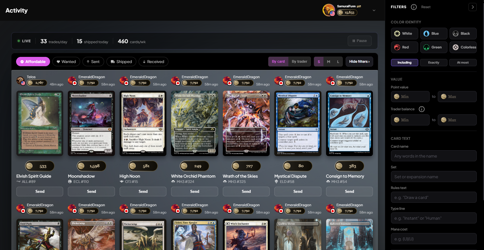
By card or by trader
If you want to know how big a package could get before you send it, switch the view from By card to By trader. By trader is essentially package mode. Every recent change is still visible, but grouped under the trader you could send it to, with their balance and a count of how many of your cards they want.
How an old want ends up at the top
This is the part of the page I find most interesting. The feed doesn't only sort by when a card was added to someone's want list. It also watches point balances.
There are two ways a card becomes sendable. The obvious one is someone adding it to their want list. The second is subtler. Say a trader adds a 500-point card to their want list while holding 499 points. If the feed sorted only by the date the want was added, and that trader earned a few points a year later, the card would still be buried near the bottom even though it just became something you can actually send.
So the feed treats changes to a trader's point balance as events too. A card's place in the feed is set by whichever happened more recently: the want being added, or the want becoming affordable. The year-old want that just became affordable sorts to the top, right next to cards added five minutes ago. Recency only decides order, never inclusion. Every card you can currently send is in the feed, and older ones are further down, not filtered out.
It updates while you watch
The feed runs over a live socket connection, so new cards appear without a refresh. That includes the balance-driven case. When any trade completes, is cancelled, or moves a trader's points, the feed checks again, and cards come and go as traders become able or unable to afford them. If a stream of new cards makes it hard to read, hit Pause next to the LIVE indicator. The label changes to PAUSED, a badge counts what's waiting, and Resume drops it all in at once.
More than cards you can send
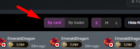
Since the page grew out of the Recent Activity module on the homepage, the header has six event pills, and Affordable is only one of them:
Affordable: cards the receiver can afford to receive right now
Wanted: anything added to a want list, affordable or not
Sent: trades that were just initiated or added to packages
Shipped: trade packages marked as shipped
Received: trade packages marked as received
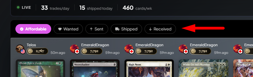
I'm sure people will find clever ways to use these in their own trading. Mostly we added them because it's interesting to watch the community trade in real time, and we figured you'd enjoy it too.
Filter it like search
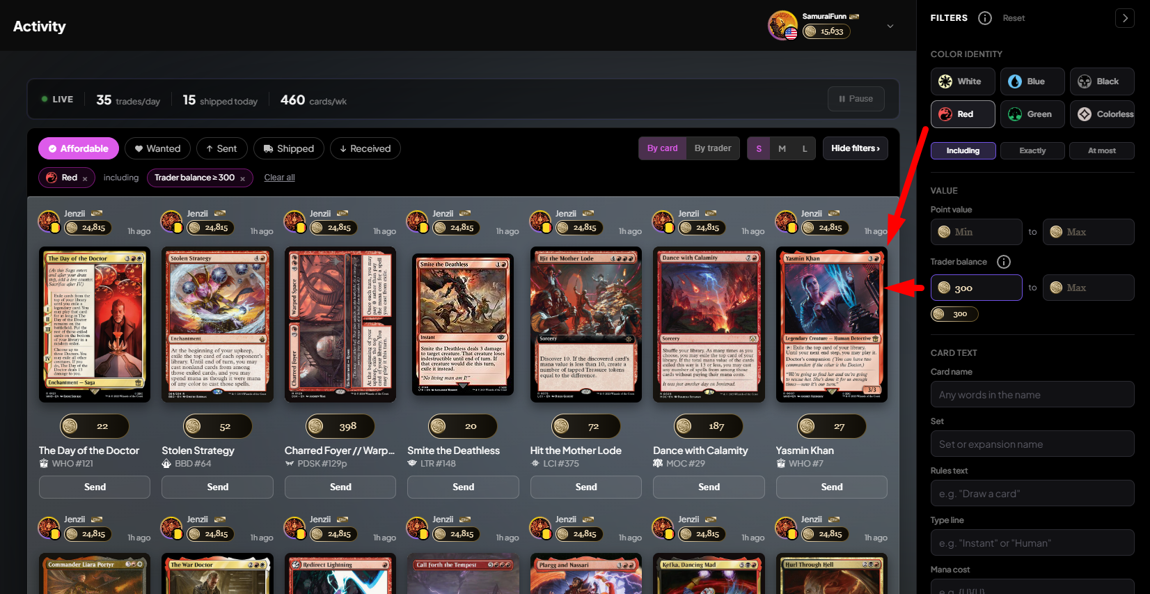
The filter rail on the right is the same one Search uses, and it's fully hooked up here. If you only want to see cards you can send that are red legends worth 300 points or more, you can set exactly that. The rail also has a filter search doesn't: Trader balance, which sits under Point value and only shows activity from traders holding at least the number of points you set. Each active filter shows up as a token above the feed, so you can clear one without opening the rail.
What changed in this release
Until this week, the Activity page had two filter systems doing the same job. The toolbar held the event pills, a Trader balance range, the Pause button, and a view dropdown, while the rail held the card filters. It read as two tools stapled together.
We split the work cleanly. The header now controls only how the feed looks: the event pills, By card or By trader, S/M/L card size, and a button to hide the filters. The rail controls what's in the feed, Trader balance included. Pause moved next to the LIVE indicator so it stops looking like a filter, and each pill got a tooltip explaining what it shows.
Visually, every card used to sit in its own frosted glass tile, about 20 of them on screen at once, which read as a wall of grey boxes. Now both views sit inside one results panel with the card art directly on it, and By trader tiles match By card tiles exactly.
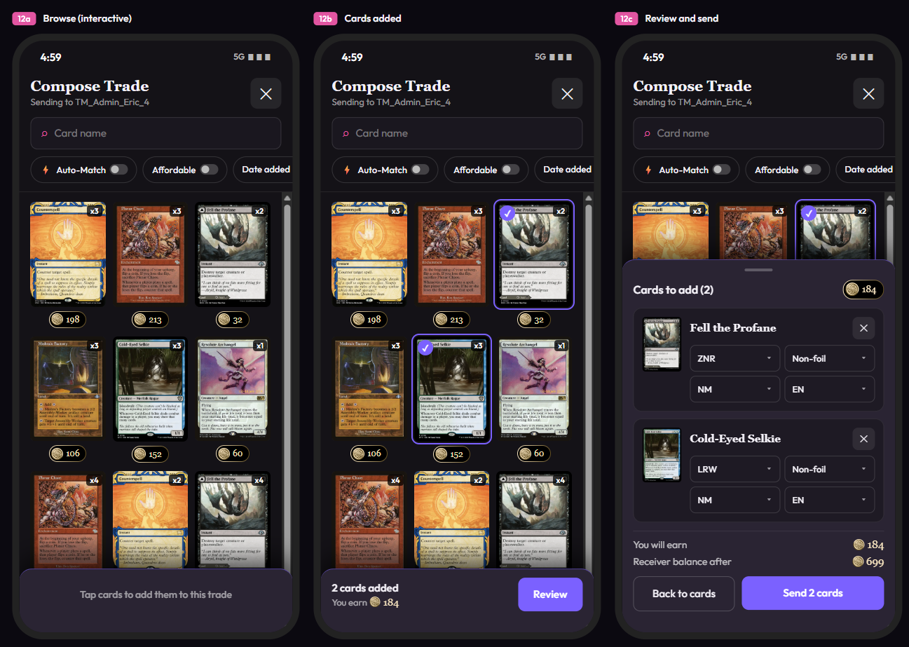
Phones got real fixes as well. The event pills ran off the right edge of the screen, leaving Shipped unreachable, and the S/M/L toggle was clipped. The pills now scroll in a single row and everything fits. Tapping Send on a tile used to open a trade window where nothing could be tapped. It's now a full-screen sheet: pick your cards, tap Review, check printing, finish, condition, and language, and send.
Open the Activity Feed, leave it on Affordable, and set Trader balance to a number you care about. If there's anything we can improve, tell us by clicking Feedback in the sidebar.
Keep reading
- Sustainable Economics Pt. 3: Year One
TradeMagic just turned one! Here's the year in four charts & where the economy stands - How It Works: Collection Focus Mode
One click collapses everything on My Cards except the search and your list, then makes the cards big. - What's New: Focus Mode, Trade Offer Revisions, and Sidebar Mode on /sendcards
Focus
Stay Connected
Follow TradeMagic for updates, tips, and community highlights:
Questions or feedback? We'd love to hear from you!